 If there is something that that is ubiquitous in health and wellness magazine covers – it is high key portraits done in studio against a white background. In the nearly 700 or so magazine covers I’ve photographed, well more than half include a similar set up.
Of course, there is a reason for the stylized approach. The first is how flattering the light appears on the subject. Also the minimalist approach keeps the viewers eyes focused on the subject and their great physique.
Secondly, it provides a brand consistency over time. When you Google “Oxygen Magazine cover” you will be served hundreds upon hundreds of results that all have a similar look and feel to the esthetic.
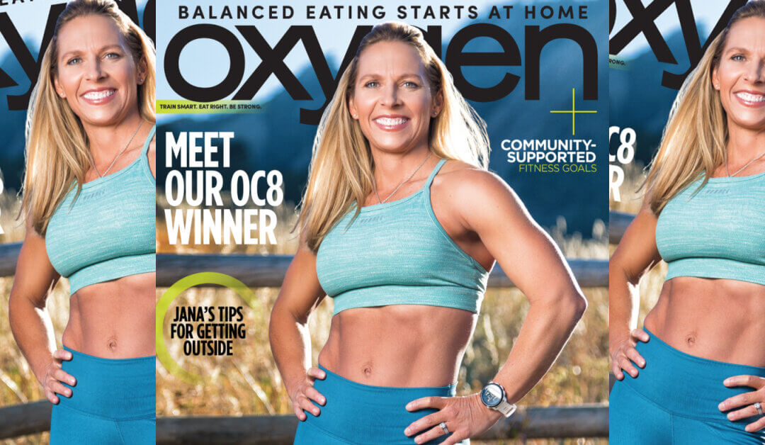
Thus when I received the request to shoot the new cover of Oxygen Magazine, but to shoot it on location, I was extraordinarily excited to concept something new, fresh and unique.
One would have to look back at Oxygen Magazine’s archives of the late 1990s to find any covers shot on location.
This shoot was to feature the winner of the magazine’s 8th annual challenge, Jana Redwine-Landfriend.
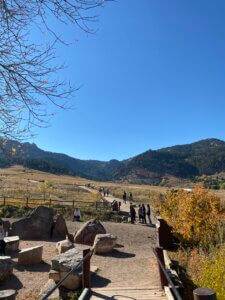
We obtained a permit to shoot at Chautauqua Park in Boulder, Colorado which showcased an absolutely breathtaking mountain range that lifted above the city.
 On a brisk fall day I flew into town that morning, picked up some gear at a local camera store, grabbed a quick bite to eat and then arrived to the park a little over an hour before call time to do a quick scout of the location.
I wanted to find a background that showcased some of the scene beauty of the location without being too distracting from the subject. I came across this wooden fence in front of a field of golden plants with the mountains in the background. This was the prime set up for the cover shoot.
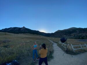
Once Jana arrived on set it was then quickly testing the lights and framing to ensure I was creating something that could be featured on the cover.
I made the decision to place a neutral density filter (ND) on my lens so I could open up my aperture on my lens. This was done so as to slightly blur out the background so as to reduce how much focus they pull without eliminating them from the image. It was about trying to find that perfect balance of incorporating their shapes and colors without so much detail as to distract from our amazing subject.
I wanted the lighting to feel bright – trying to emulate what would appear on a studio-photographed Oxygen cover. However I did not want the photo to appear to be over-lit and wanted to maintain a more natural vibe. Thus I mixed together a octabox as my key light and used the setting sun as the hair light. This gave the image a warm glow, especially as the backlight accented her hair in the shot.
From there is was about creating as many looks and poses as I could in the time I had the sun in the sky. For anyone who has shot near sunset – the window to work in is quite finite forcing one to work quickly to achieve as many shots as possible.
 After we had worked that area for some time, we hiked further down the trail where the sun was still shining as it had not yet dropped behind the mountain range to shoot a few more exercise images as well as to allow Jana to film her interview with the team.
The result of the project is one I am sincerely proud that I could have been a part of. To create the cover for such an iconic title such as Oxygen, but to take the project on in such a unique and fresh perspective was an opportunity I am truly grateful for.
A huge thanks goes out to everyone who helped make this project such a success from the creative director Stacy Jarvis to the editorial support from Rose McNulty to the incredible on-site project management from Ashley Lose.
This project was absolutely a team effort and one I am proud to showcase in my portfolio.
You can check out the full feature on Jana here.
CAMERA: Canon 5D Mark IV
LENSES: 20-700 L Series & 50mm Prime
LIGHTING: Interfit S1 Strobes
Modifiers: Aperture
James Patrick
JamesPatrick.com
IG @JPatrickPhoto


