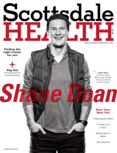
 At the start of 2017 the James Patrick Photography team was hired to do an editorial photo campaign of Arizona Coyotes team captain Shane Doan. Personally I love working with athletes, but was particularly excited to work with Doan as he is one of the rare athletes who has spent his entire career with a single team. In 1995 he joined the team (back then the Winnipeg Jets) and a year later they moved the franchise to Phoenix.
The first step, as usual, was to discuss the shoot with the publication’s Art and Creative Director. We searched online for concepts and ideas and swapped images back and forth for inspiration. Compared to sports such as football, baseball and basketball; surprisingly there are not as many creative samples that have been already done for professional hockey player photo shoots. This meant the AD and myself had a pretty open range to be creative in our planning of the shoot.
The shots we had to capture were a cover image for the magazine with Doan wearing street clothes as well as an interior art image of him in uniform. We were able to arrange a practice rink to shoot the interior images on the ice. At that point we developed a quick storyboard of pose ideas for the shoot.
When the day of the shoot finally arrived, myself and one assistant arrived approximately 45 minutes early to both get set up and to do a final scout to plan out the finer details of the shoot.
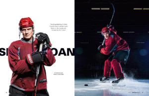 We set up a paper roll backdrop to shoot the cover on right next to the ice and scoped out where on the ice we wanted to make the interior images.
For the cover portion of the photo shoot we used 4 heads aimed at the backdrop (two on each side at 45-degree angles, one high and one low) to make the paper pure white behind Doan. We then added in two rim lights with strip boxes to edge light Doan and separate him from the background. Finally, the main light we used a white beauty dish with a diffusion sock cover for a flattering light with sharp fall off.
We had Doan pose in a handful of different looks, some with his stick and some without. Because the shoot was going ahead of schedule, we had him throw his jersey on for a few additional shots against the backdrop.
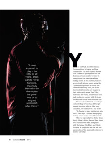
As an impromptu concept, we turned off all the lights except the two rim lights creating a silhouette art image of Doan as a value added bonus for the magazine.
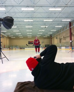
 Then we went out to set up on the ice. We worked to keep the light as simple as possible while on the ice. The rink we were in was far too large to light up so we wanted the background to fall dark and out of focus.
Two backlights were set up, each with a 7 inch reflector to throw light behind Doan and edge light him. The main light we used a small rotalux, which was softer than the beauty dish – but still had a nice punch of light.
The goal was to get the lead up to a slap shot. We marked the spot by placing the puck at where we needed it to be on the ice. All Doan had to do was skate up to the puck and come to a quick stop as he was loading up his stick for the slapshot.
For myself personally, I had to wear a shirt, a sweater and a jacket over the sweater with a beanie on my head to be comfortable laying down on the ice! We even laid down a towel for me to lay on so I wouldn’t get too wet while I was sprawled out.
I shot both in vertical and horizontal orientation, with the latter allowing a lot more flare from the edge lights into the lens to create an added effect.
After a dozen or so frames we had all the shots we need and called the shoot.
Postproduction on the images was kept extremely clean and simple. For the cover images we did a high contrast black and white edits of a few different images that the AD and I both enjoyed.
We did end up using the silhouette image so all that was needed there was some toning with the curves palette to darken up the scene a bit. We also used a shot in studio wearing the jersey.
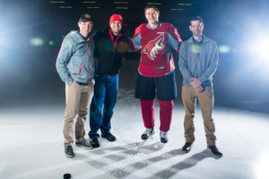 The shots on the ice required a lot more editing and toning – but not much on Doan himself. Most of the work for the shots on the ice were to remove distractions form the background. We cloned out the scoreboard behind Doan and removed half of the overhead lights as we felt they pulled too much attention away from the main subject.
We also decreased the yellow tint of all the overhead lights and pushed them more towards the blue channel.
After that, the edits for Doan were quite simple. There was some quick toning to increase contrast in the highlights and shadows and then a bit of sharpening to make the ice flying off his skate look more impactful.
 Once all was said and done, we had a very wide variety of options published in the final magazine feature including the covers in lifestyle attire on the cover, shots in jersey in studio, a silhouette shot in studio as well as the shot on the ice.
The entire shoot lasted under a single hour for every single shot.
EQUIPMENT USED:
Canon 5D Mark IV
Canon 24-70 L Series
Canon 70-700 F2.8 L Series
3 Paul C. Buff Einstein E640 Monoblocks (main lights and rim lights)
4 Paul C. Buff AlienBees B800 Monoblocks (backdrop lights)
Paul C. Buff White Beauty Dish & Diffusion Sock
Elinchrom 27.5” Deep Rotalux with Paul C. Buff Speedring
6 Paul C. Buff Light Stands
1 Matthews C-Stand
James Patrick
jamespatrick.com
IG @jpatrickphoto


